
Nimbus (Design System)
Co-led the creation of Capterra’s first design system, Nimbus — from audit and testing to stakeholder buy-in, token and component design, and rollout planning. The system improved design consistency, reduced dev handoff errors, and led to measurable gains in both conversion and user trust.

Role: Project Lead and Co-lead UX/UI Designer
Responsibilities: Strategize the implementation of a design system, be an advocate for design, get buy-in from cross-functional stakeholders, drive the development and evaluation of usability studies to improve component design, lead discussions about timelines, define design tokens, design accessible, beautiful, responsive components, discuss the creation of APIs, implement CSS changes, define governance for components, run usability tests on all components
Duration: Started April 2019 | One year
Scope & Considerations
We are straddling two different tech stacks, Rails and React
Capterra never had a design system before
This project was design-led, therefore needed buy-in from product, tech, and stakeholders
Had to lead this project while being the design lead for two other major page templates
Benefits of a Design System
More modularity and consistency in design
Faster workflow, iterations, and hand-offs to developers
Designers and developers speak the same language
Problem


In 2018, our company had moved towards using Brad Frost’s atomic design. However after using it, we found it too granular and limiting for our use. As the number of designers and developers grew, design inconsistencies and debt grew. In 2019, Amelia, another fellow UI designer, and I decided to do a visual audit of our site to see the extent of inconsistencies and how our users may see our site as a whole.
In doing so, we found that there were so many inconsistencies. Just for a start, we had various versions of our search bar, cards, buttons, and use of typography. We wanted to take this opportunity to create a design system in order to have more consistency and modularity.
Master Plan

I worked closely with another UI designer, project managers, and developers to plan out, design, test, and create themable tokens and components for our design system. It was important to think about how we may make our design system flexible and themable so that it could possibly be used for our sister sites as well. Below outlines the steps taken to make a design system at Capterra:
Audit: Do a visual audit of Capterra.com to see the extent of inconsistencies and how our users may see our site as a whole
Ideation: Take a look at industry standards for design systems and think of how we can design beautiful and accessibly components
Design: Define design tokens with tech. Create a list of commonly used components and use defined design tokens to create preliminary component designs
Testing: Test out these components via unmoderated usability tests and A/B test to see their usability and effects on business metrics, such as conversion rates
Refinement: Review test results and review components accordingly
Development: Work with dev team to create a code repository of components; extensively discuss all possible interactions and use cases with dev to define API
Governance: Define a clear governance process so that the design system can healthily grow and be used by other designers, without introducing inconsistencies; Our document explains to do if:
Can’t find a component that meets their needs
New variant of that components needs to be introduced
There are questions or concerns about the design system
Deployment: Create a plan for roll out on different page templates with product managers and a designated dev team
This step is still ongoing. We are currently straddling different tech stacks, like rails and React, making it difficult to make a clean and swift move to Nimbus, Capterra’s design system. There will need to be ongoing collaboration between designers, product managers, and developers to carefully replace all the old code with newly designed components.
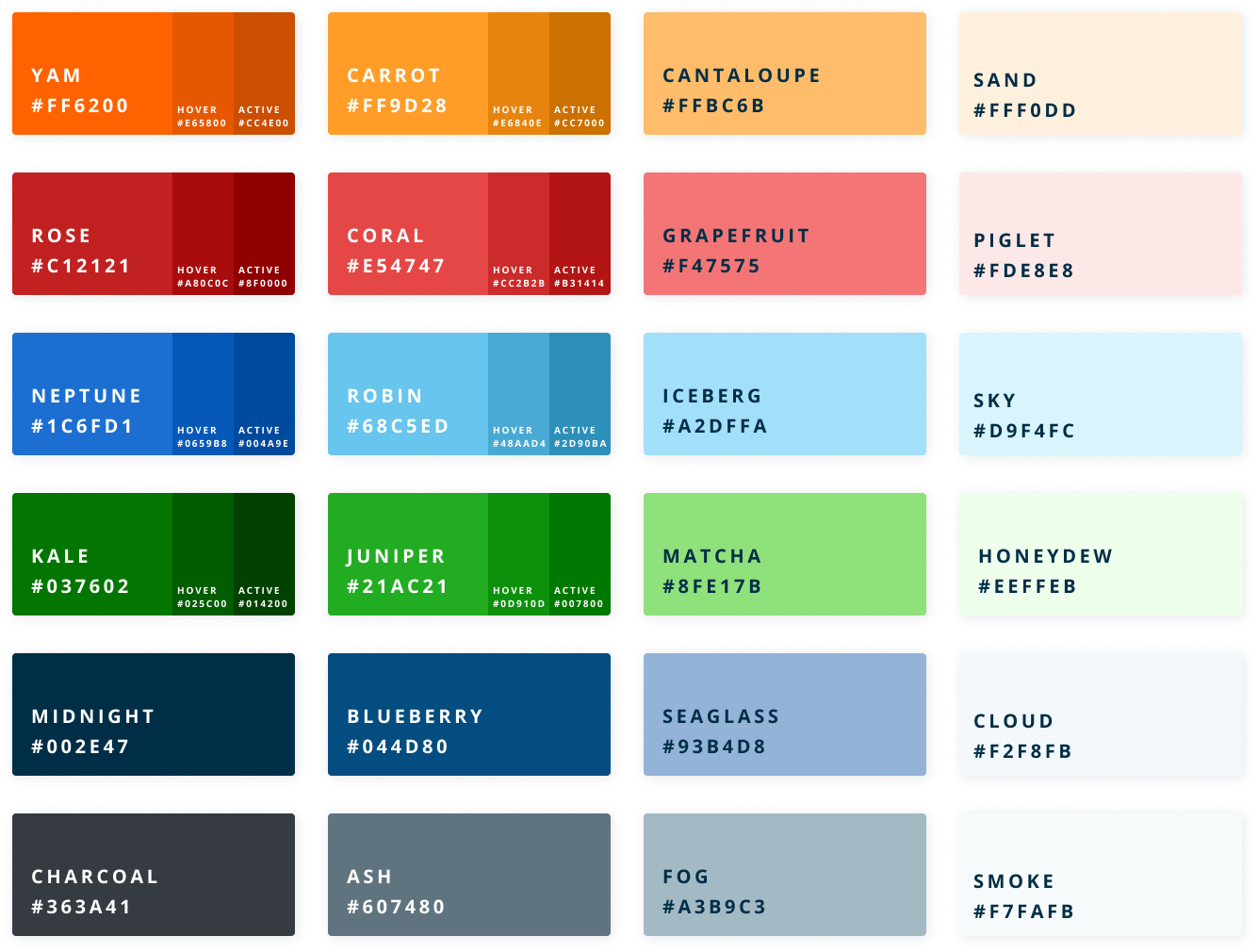
Step 1 | Define colors and typography
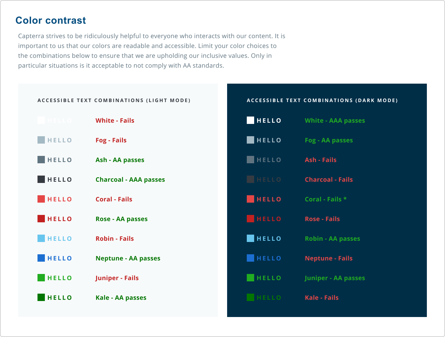
For context, we didn’t have a lot of colors on our site because only one of our brand colors (outside of colors designated for text) was color contrast compliant. In addition to the brand palette, we created an extended color palette for UI use. It was especially important that everything we introduced to the new design system was accessible and user friendly.
Old styles:

New:
Accessibility matters
Accessibility wasn’t an afterthought—it was baked into the foundation of our design system from day one. Our team prioritized building tokens, components, and patterns that met WCAG 2.1 AA standards and supported users across a wide range of abilities.
To make accessibility scalable, we embedded it directly into our design tokens (color contrast, spacing, typography) and into our component specifications (keyboard navigation, focus states, semantic HTML).
We also created robust governance documentation that explained:
Why certain color combinations were or weren’t allowed
When to use specific components based on background context or interaction state
How to avoid common accessibility pitfalls in implementation
By codifying these guidelines, we empowered other designers and developers to build inclusively—without needing to be accessibility experts themselves. It also ensured consistency across our Rails and React stacks, despite limited tech bandwidth.
Accessibility wasn't just a checklist—it was a core principle of our system, shaping how we thought about interaction, inclusion, and responsibility at scale.
Step 2 | Test
We knew that we needed data to gain support from the stakeholders and get bandwidth for this project. Also, Capterra has millions of visitors every month, so we wanted to make sure that our changes would not hurt revenue. We tested the buttons with the new colors, typography, and pill shape.
On left is our old button style and on the right is our new button style
Our goal was to not have any negative affect on conversion rates and vendor conversion rates. Thankfully, there was ~20% lift in both conversion rates and vendor conversion rate in our first A/B test involving our buttons.
Step 3 | Get buy-in
Now that we had the data, Amelia and I created a presentation that explained all the benefits and potential improvements of having a design system and shortcomings of not having one. Through many conversations, we got buy-in from major stakeholders, product team, and developers, which helped us get tech bandwidth and convince the product managers to dedicate two design team members to this project.
Step 4 | Define rest of the tokens and components

After looking through multiple resources, such as Google’s Material design system and IBM’s carbon design system, we learned how others were doing design systems. The team and I looked through and researched several different software, such as Adobe XD, Figma, and Sketch/InVision to see which one we should use to build out our design system. We ultimately chose Figma because, at the time, it was the only software that allowed live collaboration between designers. This was a very important feature for us because only Amelia and I would be work on this massive project and it was imperative for us to have constant communication and be on the same page. After looking through our site, we found ~40 components, such as buttons, cards, and links, that were frequently used. Using Figma, we designed, spec-ed out, and wrote the governance of all these components.
List of tokens and components:
Filter
Form
Navigation
Icons
Input Field
Link
Listing
Lists
Loader
Modal
Pagination
Product Card
Progress Indicator
Radio Button
Color
Typography
Drop shadows
Containers
Action Bar
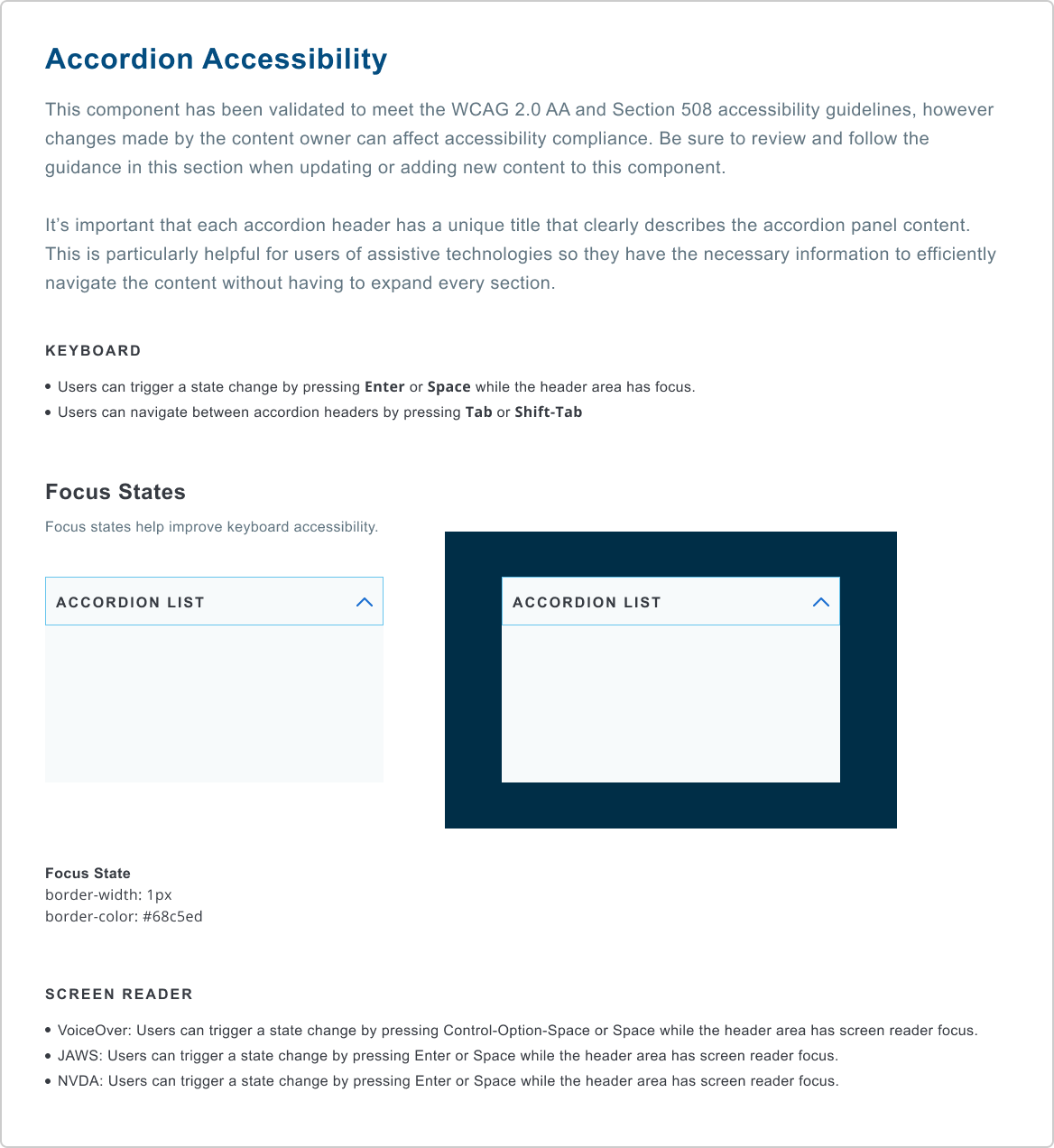
Accordion
Alert
Button
Breadcrumb
Compare
Carousel
Checkbox
Drawer
Dropdown
Important considerations for components and tokens:
Check to make sure it passed WCAG 2.0 level AA
Be mindful of a11y guidelines for accessibility
Must be seamlessly responsive and modular
Must be consistent, but not restrictive
Feel free to click on the images below to see an example of the documentation
Review Stars
RuleSave
Search
Side Navigation
Share
Strength Indicator
Table
Tab
Tag
Thumbnail
Toast Message
Toggle
Tooltip
Tray


Step 5 | Coordination and roll out of “Nimbus Lite”
Since we limited tech resources, the full roll out of all the 40 components was estimated to be a year long project. While engineering worked on the full rollout, we launched “Nimbus Lite” to deliver immediate visual improvements using color, typography, and button styles. Nimbus Lite comprised of the typography, colors, buttons, and making sure that all the elements on every page were consistent.
Some of my notable accomplishments from the Nimbus Lite project:
Designed over 20 components
Edited and QA-ed over 120 Rails pages with HTML, CSS, and some javascript
Created animations for our error pages, using Adobe After Effects and Bodymovin
Helped coordinate and plan out the full roll out of Nimbus, our design system
Outcomes:
6% increase in overall conversion rates, which increases revenue
10% decrease in page speed in terms of first contentful paint, which improves tech metrics, user experience, and SEO
5% increase in trustworthiness, measured through survey feedback
Improved consistency between mock-ups by various designers
Faster workflow and mock-up creation on Figma

Example of how we can use components to build a mock-up
Next Steps:
Optimize our components even more for keyboard navigation and screen reading compatibility
Research into themability for our sister sites
Partner with tech and product representatives to replace all old designs with our design system
We still have a long way to go before our design system is fully implemented on Capterra.com. However I am super proud of the work that has been accomplished in the last year, especially since we had to do it partly remote.

Before:
After:


