
Improved Monitoring for AWS Outposts
Redesigned AWS Outposts monitoring by creating a unified Metrics tab that prioritized health visibility, supported both daily checks and troubleshooting, and reduced the need for external dashboards. Also led internal research that sparked long-term UX advocacy within the team.
Role: Lead UX Designer
Responsibilities: I worked with a product manager and engineer to scope the solution, conducted user interviews with existing Outposts customers, synthesized insights into monitoring needs, and designed a contextual metrics tab within the console.
Duration: 3 months
Users & Audience: Technical roles managing hybrid or edge infrastructure, such as Cloud Infrastructure Engineers / Cloud Architects, and DevOps Engineers
Problem
Outposts users—primarily infrastructure and DevOps engineers—had no direct way to view performance metrics in the Outposts console. To monitor status, they had to switch to the CloudWatch console, remember specific Outpost IDs, and build custom dashboards from scratch. This created unnecessary complexity, especially during incident response.
Step 1 | Understand the ask
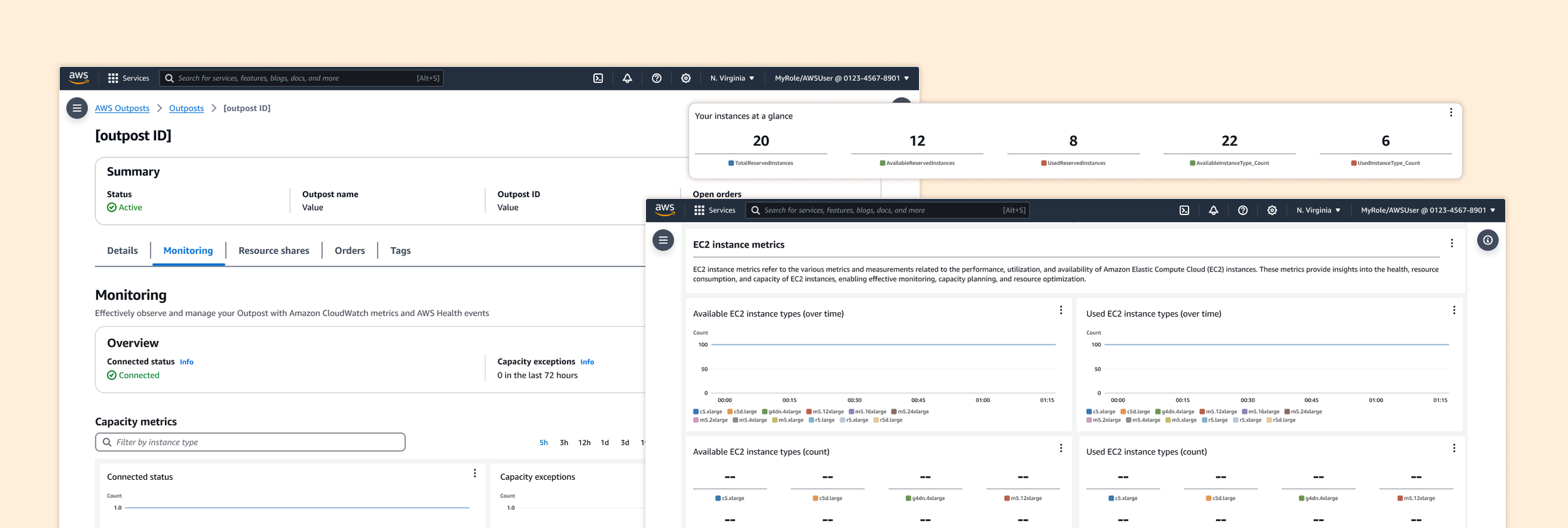
The original request from the product manager was to make a minor improvement: consolidate existing metrics—previously spread across four separate tabs (Available EC2 capacity, Available S3 capacity, EBS capacity, and Service Link)—into a single tab in the AWS Outposts console. Users had found it inconvenient to click back and forth between tabs, especially since each tab typically only contained 2–3 graphs.
While users could build their own view by manually adding each graph to a CloudWatch dashboard using the “Add to Dashboard” button, this workflow was tedious and time-consuming. Rather than simply grouping all the graphs under one tab, I saw an opportunity to rethink the monitoring experience: Which metrics matter most? Why? Are these the right metrics at all? By reframing the request, I aimed to create a more purposeful, user-centered view that prioritized relevance, reduced cognitive load, and improved troubleshooting efficiency.

The original UX:
Step 2 | Interview customers
The product manager was hesitant to reach out to external customers, since similar outreach had been done the previous year without resulting in any feature releases. To avoid upsetting already frustrated users, they asked me to hold off on external interviews. I understood the concern but also knew that fresh user insight was critical to designing the right solution; so I explored alternative paths.
After speaking with stakeholders and engineers, I learned that the Amazon Robotics team used AWS Outposts to support robotics operations in fulfillment centers. I gathered a few internal contacts and partnered with an engineer on the Outposts team to conduct interviews.
Screenshot of whiteboard exercise with internal customers
From those sessions, I uncovered two key monitoring behaviors:
Proactive monitoring: Daily checks to ensure everything is working as expected
Reactive troubleshooting: Investigating metrics only when something breaks
Nearly all of them had built custom dashboards outside the AWS console, saying the native tools didn’t provide what they needed in real time. These insights helped us focus on what mattered most to users and when they needed it.
Step 3 | Design decisions
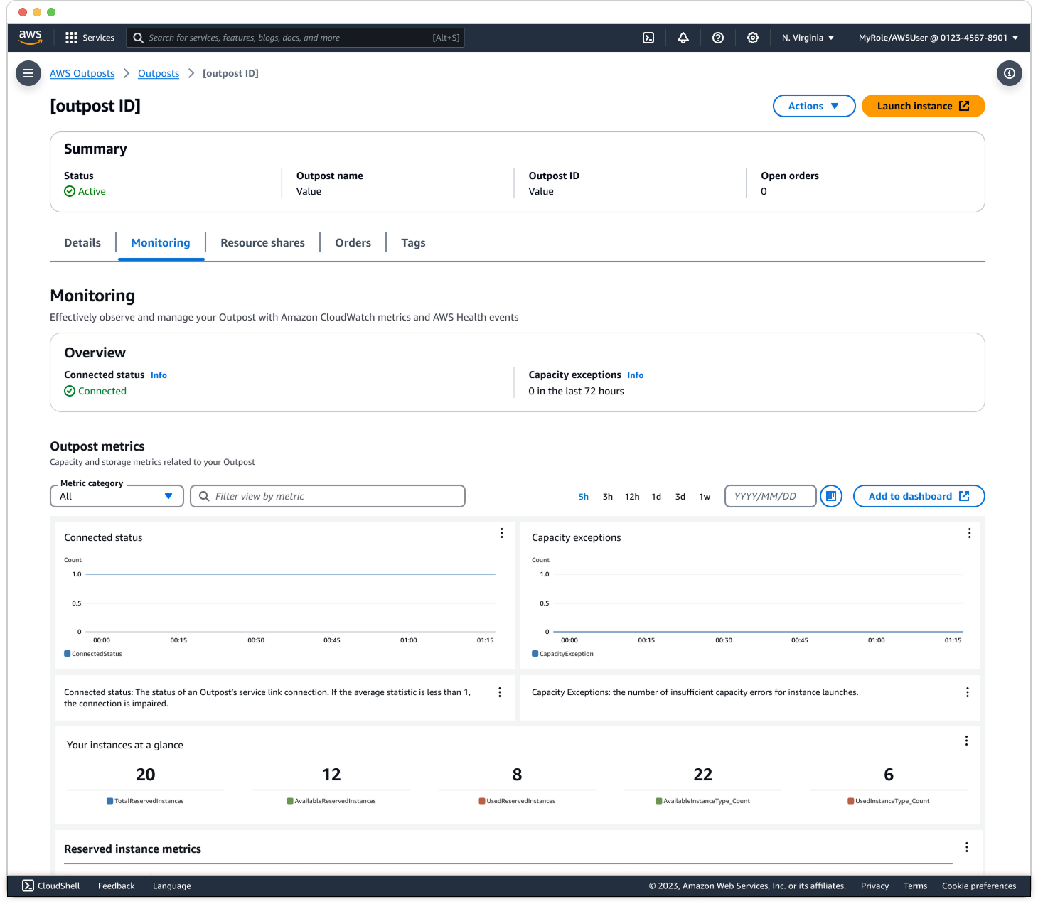
UX Change 1: All in one tab with new order
I designed a new Metrics tab within the Outposts detail page that surfaces the most critical health information at the top, with deeper system metrics available below. For example, “Connected Status” and “Exceptions” help users quickly determine whether an issue is isolated to their Outpost or part of a broader AWS event. These metrics are designed to answer the key user question: "Should I be concerned?"
UX Change 2: One-Click ‘Add to dashboard’
Previously, users had to manually add each graph to CloudWatch, which made cross-service monitoring time-consuming. I introduced a one-click option to add all Outpost metrics at once, streamlining the workflow and reducing setup time.
UX Change 3: Descriptions of metrics
Through internal conversations, I learned that many new engineers and admins were unfamiliar with the meaning behind certain metrics. To support onboarding and reduce confusion, I added concise descriptions under each graph to explain what the metric measures and why it matters.
While the original idea was to reduce visual clutter by simplifying the view, interviews revealed that users preferred seeing all metrics in one place to enable comparison. The final design strikes a balance between clarity and completeness, supporting both quick daily health checks and deeper troubleshooting, which reduced the need for external dashboards.
Results
After launch, users shared that the new Metrics tab made it significantly easier to assess Outpost health at a glance, without switching between tabs or leaving the console. Several users mentioned they no longer needed to maintain separate CloudWatch dashboards for Outposts, saving time and reducing manual setup. Internally, the Monitoring tab saw increased engagement, indicating that more users were relying on it as their primary source of status and performance visibility.
Beyond the product impact, this project also helped shift team culture. Before I joined, the Outposts team had never conducted user interviews. By involving engineers directly in the research process, they saw firsthand the value of understanding customer needs. This led to stronger cross-functional collaboration, increased trust in UX, and greater advocacy for ongoing user research within the team.